It’s official, nature is 2016’s muse.
There’s an irrefutable trend emerging for 2016 and beyond: Natural Colors and getting Back to Basics.
Today’s day and age has conjured a new wave of economically conscious, purpose driven, and health focused individuals, making the key colors for 2016+ all about newness, growth and well-being. Whether in art, architecture, fashion or interior design, today’s top influencers are gravitating towards natural tones, softer shades and earthy hues. There is a growing trend for the desire to unwind and disconnect, both from technology and our daily chaotic grind.
A desire for simplicity leads to softer, more serene color palettes. Color and design trends are paying homage to the beauty of natural resources and combining that beauty with striking metals and bold outlines. Think lush landscape meets industrial design.
So, here are the color trends that we at Possibilities for Design see leading us to an even more natural 2017.
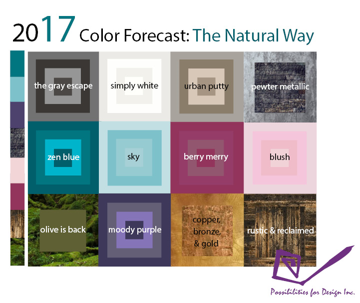
The Gray Escape: Gray is the perfect complement to a neutral color palette. Think stormy clouds and warm chinchilla. Gray has become the epitome of sleek, simplistic and stylish design, as more “sophisticated” buyers tend to prefer these neutral color palettes.
Simply White: Benjamin Moore’s Color of the Year is possibly the most popular for 2016. It mirrors the sentiment of well-being and the desire to rest from the chaos of our world. White not only puts us in a renewed state of mind, but also flatters and gives way to bold vibrant colors, allowing you to punctuate your space. Visually, it gives us a heightened perception of space and gives angles and edges a sharper definition. Its simplicity allows the architecture and form of a space to speak for itself.
Urban Putty: Putty, and its sister palette of taupes and beiges, all derive from elements in nature, so we are naturally drawn to their earthy innocence. They are subtle, warm, soft and welcoming. Their essence appears solid, reliable and supportive and instill a sense of balance and stability.
Pewter Metallic: There’s a growing demand and desire for authenticity that derives from the artisanal, build-to-last, “Made in America” movements that are sweeping the nation. Pewter metallic reflects the craftsmanship of the working man, something that is becoming more and more revered, combined with a desire to disconnect from our technologically dominated world.
Zen Blue: Color Marketing Group says a sea of aquas, emeralds and teals will dominate the world of design in 2017. These nature-inspired blues are soothing as they resemble the life-giving nature of water. It resonates with authenticity and our desire to tap into what is real, not faux.
Sky Blue: Strong blues stimulate clear thought, while soft blues calm the mind. It’s no wonder Pantone named this light blue tone one of its 2016 Colors of the Year, calling it “Serenity.”
Note: Millennials are especially drawn to light blue and its “new age” essence.
Berry Merry: This color palette is included in Sherwin-Williams color forecast for 2016. The berry colors found in nature give off a social and playful essence. Think garden parties in Spring with natural, social interaction, as opposed to cellphone distractions. Different shades of berry gives a splash of life and happiness to our surroundings.
Blush: Or rather “Rose Quartz” – one of Pantone’s colors for 2016 – reflects a gentle tone that also conveys compassion. It’s sophisticated, soft, lighthearted and serene, allowing us to rest from the chaos of our world and emphasize our physical, spiritual and mental well-being.
Olive: Green is the center of the color spectrum, and is therefore the balance of color. Color Marketing Group predicts an earthy olive hue will be North America’s “key color” for 2017. Again, emphasizing that growth, newness and well-being are revered now more than ever. And what better way to express a balanced and energized future than the most primitive color of all: green.
Moody Purple: The shortest wavelength is violet, and therefore; it takes awareness to a higher level of thought and encourages contemplation and meditation, which is why it is often revered for spiritual awareness. This lustrous palette of powerful plums, blackberries and dark violets will compete for 2017’s most popular bold color.
Copper, Bronze + Gold: Copper, bronze and gold finishes play into the “back-to-basics” trend sweeping the nation. From floors to furnishings, oil-rubbed bronze, and aged metals are making a name for themselves in 2016 and beyond.
Rustic and Reclaimed: The ever-growing trend for “rustic and reclaimed” surfaces, particularly in wood, reflects our connection with nature. The most sought after trend we see is the “unexpected combination” of modern, sleek design coupled with rustic elements.
As we move forward in this technologically dominated age, our entering-2017 mindset will be relieved to see such an abundance of nature-inspired themes that 2016 has paved the way for. Using colors to create spaces that bring people together in a time when connectivity is more revered than ever – we can’t wait to be part of this new frontier for interiors.
Blog by Doris Pearlman, Possibilities for Design